

Traveling is never just about seeing new places, instead I believe it’s about widening your own horizon. At the same time, for me personally it is about collecting little secrets along the way and turning them into potentially wearable art. This article takes you behind the scenes of my Traveling Patronage Paris 2026 edition. Welcome to the second part in this series. If you have missed out the first one check it out here.
Traveling Patronage is an ongoing project of mine that began after I traveled abroad to Buenos Aires for the first time in 2019. The goal was, and still is, to capture my observations in condensed design patterns for silk scarves. Think of it as a visual diary that pops out a concrete product at the end of it.
This April, I went to visit Paris again after a long time and found a similar way of inspiration walking the streets, visiting the Louvre, roaming through Maison Rodin and the Palais de Tokyo. Let's take a look behind the scenes of Traveling Patronage Paris Edition 2026 together. What are the source inspirations, how to come up with color palettes, and most excitingly, how to design a full 3D set for your future renders.
Is there a Concept?
After my first article about Traveling Patronage, quite a few of you asked if I have a concept in mind before I start drawing. From a design perspective, I probably should have one, but to be frank with you, I really don't. The decisions I make about collecting inspiration, and even how to combine it in Procreate before drawing the patterns, are purely emotional.
Design only enters the stage once the pattern layout is in place, and I dabble in color palettes and set design for the 3D renders. In fact, many image resources I collect never make it into the final designs.
In numbers, this means I took roughly 300 pictures while wandering the streets of Paris, but used only about 12 of them in the final three designs. To visualize this, let's take a look at the first pattern called "Cœur du Serpent" (Heart of the Snake):

Cœur du Serpent only holds four different motives from three different locations:
-
Les Halles: On the North side of Les Halles, a building with intriguing yet old-school surface geometry caught my attention (img 2).
-
Maison Rodin: Heart and fire combination from one of the columns that had unfinished busts placed on top of them and the ornamental ironwork from some of the outer window frames of Rodin's former home (img1 and 3).
-
Hôtel de Sully: While walking randomly across the fourth district of Paris, I came across a majestic entrance, apparently to a hotel. When I saw the detailed doorknob with two snakes facing each other, I knew it was a motif I couldn't miss out on (img 4).
I listed the above in the order of discovery, but the selection for a final design works in mysterious ways. As described before, I instantly knew that the snakes would become a first-rank motif. Therefore, after I roughly sketched out the idea, I started placing the snakes at the center of my design; only later on, they moved into the corners, still taking a premier position:

The Final Design Puzzle
I spent seven days in Paris. Some of them were predetermined by visiting places I had to set up appointments to get into, like the vegan Michelin-starred restaurant Arpège, right across from the Maison Rodin.
Other days were random, unplanned, and marked only by spontaneous surprises. That is exactly what makes the Traveling Patronage project so exciting for me. It is uncontrolled and just happens. The scarves were crafted from my visual observations, the various emotions I felt during my stay in Paris, as well as retrospectively.
Cœur du Serpent
You already read above how the design came to be and which elements of my photo catalog I used. Specifically with this design, it is easy for me to guess why I chose the elements that I did:
The serpent doorknob reminded me of the movie "The Neverending Story." It was one of the first books and movies I watched together with my dad. I think we both loved it almost equally as much as "The Last Unicorn." Real tearjerkers, both of them. This is probably why I could not use it as a central motif, and so I let my emotions guide me on this one.

Le Lapin Dans le Ciel
Funny enough, Bunny in the Sky is probably the most versatile design I crafted this time around, with all four main motifs being extracted from four different locations.

-
Musée des Arts Décoratifs: The ceramic bunny (img 1) I encountered in the Musée des Arts Décoratifs took instant center stage. It was just too cute to not force it into that position. Sometimes I can be stubborn like that, where I try as many variations as needed to make something fit.
-
Square de la Tour Saint-Jacques: Most of my walks ended up happening across the 4th district of Paris. Around the corner of the Tour Saint-Jacques monument my attention got drawn to this sticker plastered electrical box (img 2). The blue one made it into the final design. Again, not an easy one to incorporate for me but with some nudging I think it came out quite well.
-
Esplanade André Tollet: An open and public space with a fountain at its center where the birch trees (img3) stood out to me instead of Paris' classic opulence. I used the bark as a seamless background pattern blended into the final scarf design.
-
Château de Chantilly: The last inspiration came from the ornamental opulence of Château de Chantilly. On our way driving from Paris to our final destination in Germany, we saw the sign and spontaneously decided to take a gander and visit the Château. The sky couldn't have been bluer, the sun was high, and the golden adornments of the interior couldn't have been more intricate.
Les Escargots de L'Infini
The design I finished last I call Les Escargots de L'Infini. While snails may feel like an obvious motif when visiting Paris, as a vegan, it's not obvious to me, and it came to me in the shape of a vase exhibited at Maison Rodin. But let's break it down.

-
Musée du Louvre: A well-known ornament of the Parthenon on a miniature model (img 1) and a coat of arms insignia (img 2) on The Denon Salon ceiling that stood out to me. Both felt like a piece of history easily forgotten yet memorable. I liked that paradox just enough to make it part of the final design.
-
Maison Rodin: Heart and fire combination from one of the columns that had unfinished busts placed on top of them and the ornamental ironwork from some of the outer window frames of Rodin's former home (img1 and 3). Also from the exhibit, the aforementioned vase that made the snails govern that scarf felt like a true surprise in that whole exhibit. I also loved the vase's colors, and it truly stood out in rooms full of plaster busts and carved stone.

I often don't put a recipe on these types of designs; instead, I let impressions and emotions guide me. But there is a phase in any design, no matter its final output, where a more logical and rational element takes over the process. I think that part only entered the "stage" for me once I started preparing the final renderings in Blender, but in other, more user-facing products, this phase honestly takes front and center.
Everyday Colors
A super important element in every design is colors. They can make or break a design, and I love paying special attention to them.
During the pandemic, I started an Instagram account with two friends called colorfeed.of.the.day. It helped take my mind off things, since restrictions in Peru were on a whole other level than in other countries. We almost made it a sport to find cool and exciting color inspiration.
Some of it came from really exciting things like a sea snail xxx, but most of it literally fell into our laps, as if walking around a city or town; we just had to do it on Pinterest.

This is exactly how I love to discover color. For all three scarves, color schemes literally presented themselves; after that, it was just about mixing, matching, and adjusting:

A Transformation by Design
Many years ago, my parents went to Paris together. One of the goodies they brought back was a thin booklet about a show they had seen at the Lido. Back in the day, actually until 2022, the Lido was a famous place for Parisian cabaret, or in more simple terms, topless, high-end ballet dancers wrapped in an opulent amount of feathers and rhinestones. By the way, the booklet has been with me to this day:
After my partner proposed to me in 2015, it was no coincidence that we went to see a show at the Lido about a week after. He knew I had wanted to see one of their grandiose spectacles for quite some time now. And it truly didn't disappoint!
With similar excitement, we booked a show this time around, unaware that the actual cabaret had closed its doors forever and that the Lido had instead been transformed into a theater musical hall now called: Lido 2 Paris.
While I was surprised at first, I loved "Les Demoiselles de Rochefort" and its lighthearted storytelling. No topless dancers, no feathers. Minimalistic yet smart stage design and costumes inspired by the Riviera 70s. The shining highlight: sequins, no rhinestones. But take a look yourself:
While the musical show didn't become a direct motif in my scarf designs, it did in the texturing process and the final renderings. I'll cover the texturing in an additional blog entry, but let's dive into the set design here:
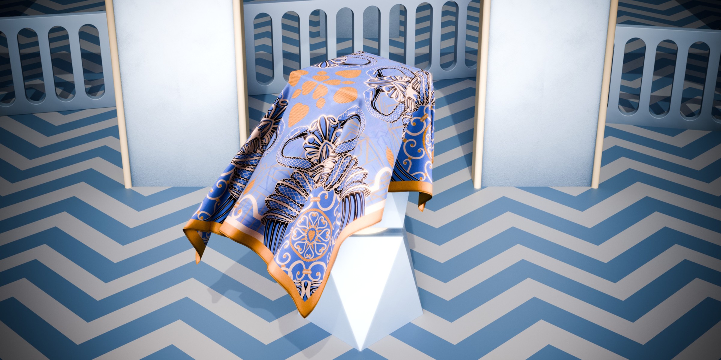
I started by imagining what type of stage would suit a scarf. Something simple, like a modular set of stairs, with props that can be easily removed and added. For the snake design, I went all out and built a full stage with a pedestal at its center and some layered arches in the back:

The hardest part is probably getting the fabric simulations right. I usually use the hook mechanism in Blender to make fabric "listen" to me and animate the empty objects the vertices are usually paired to. After that, I duplicate the fabric, apply all modifiers to the original, and use the smooth sculpt brush to "iron out" what I do not like.
As for the Bunny design, I chose a set that reminded me a lot of how Lido shows worked before, where a chandelier slowly came down from the ceiling and dancers literally danced in the air. But instead of a chandelier, I kept it simple, just working with a swing and some cloud props:

For some reason, the last design felt like the most obvious choice, and I didn't haggle over it as much as the others. I placed the pedestal staircase, added some frame props and the diamond flooring, and got it set up fast. I did debate the camera angle for a second but then went for the top version cause it felt like it gave out the best shot:

The uniting thread is the patterned background and flooring across all three, as well as lighting that focuses on "spotlighting" the scarf instead of a clever, all-sides lit product shot. I also added some glare, a mix of denoising plus original grain in the post-production pipeline directly in Blender.

Quick Tips
The Silky Endavour: Anisotropy
The most fiddling I did while rendering this series of scarves was with the anisotropic values. You are probably thinking: "What now? Ani-what?" Yes, that was my reaction too. It's been so many years since I have been working in Blender and Substance Designer, yet anisotropic was only something I had heard of, never truly used or looked into.
Anisotropy is part of the BSDF shader in Blender; this value is "what makes the cookie crumble," or so to speak. It helps make silk look believably like actual silk by capturing an object's sheen in 3D and stretching the highlights so they blend well with the rest of the textile, in our case. I highly recommend watching this video as it helped me really understand what I was supposed to do to fix my visuals:
Lineart From Final Design
A spontaneous discovery of mine while writing this article was how easy it is to use ComfyUI to create line art from your finalized artworks. The images throughout the article that showcase the sources vs. the linear aspect of the scarf designs took less than 3 minutes to put together.
-
Prepare the graphic layers so all visible elements show.
-
Put the graphic into this ComfyUI local setup.
-
And evoila lineart is done:

All in all, this trip has been an adventure. I think for me, all of my travels are. I don't jump from bridges or climb skyscrapers, but to me, the quiet discovery turns traveling into an adventure. Sometimes it is a doorknob or the captivating bark of birch trees; at other times, it is how the sunset sparkles through the leaves of palm trees (just this morning), and the sun sets in an array of spectacular colors during air travel (this happened on my first flight to NYC in 2013).
Discovery and the curiosity that comes with it should be something we never let starve, not as human beings and definitely not as creatives!
Support Me
If you enjoy my writing, please consider supporting me. There are several ways of doing so, and not all of them cost money: