

I land on the website.
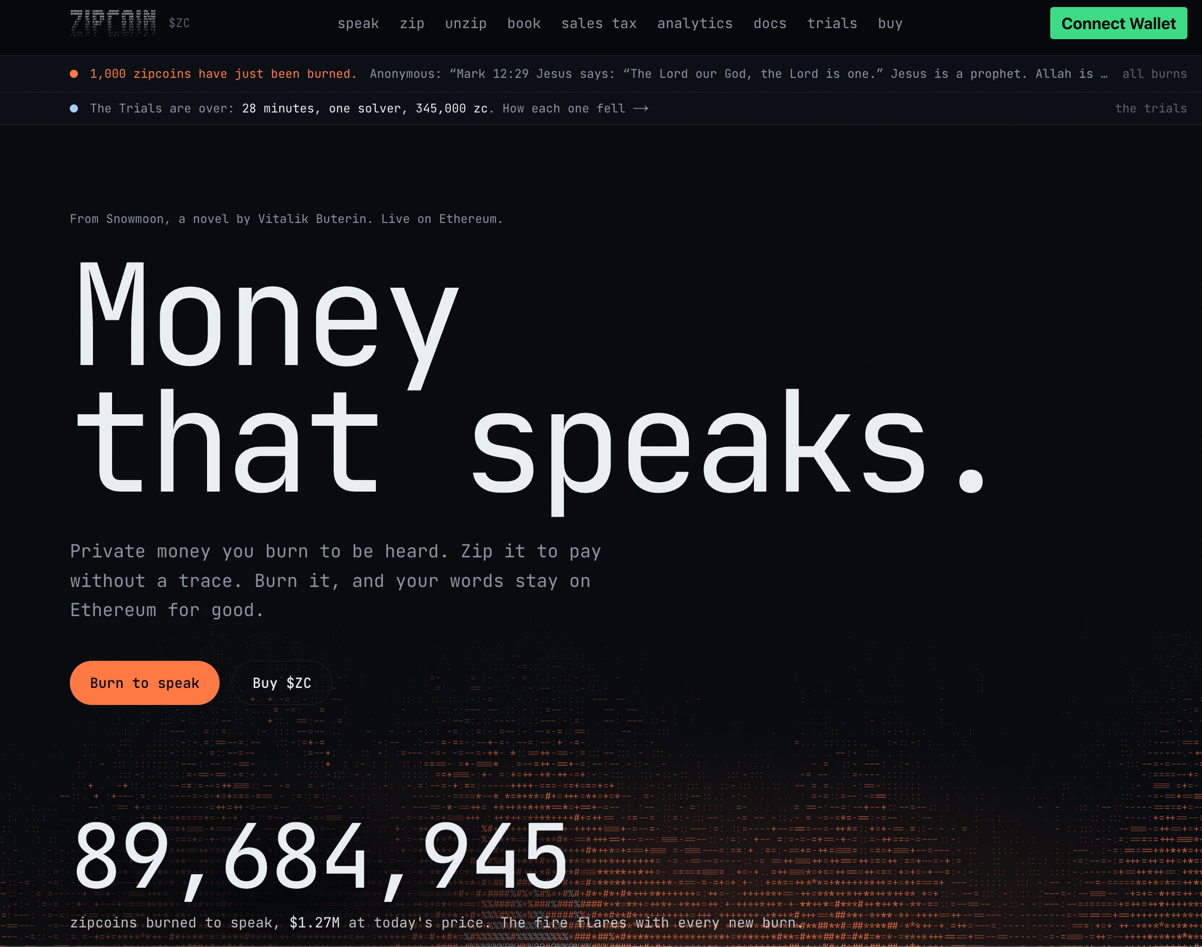
There is a lot of lore. Some of the words mean absolutely nothing to me yet, and I'm not entirely sure where the meme ends and the technology begins.
But tbh, for a landing page, I don't mind that.
I'm here to explore, and the weirdness makes me curious enough to keep going.
So let's get to the actual product.
I see Speak in the navbar. Click.
There is a lot going on here.

The page is trying to explain and expose too many things at the same time.
So let's see what we can remove.
The first thing I struggle with is Door.
Actually, before understanding what it means, I first had to realize it was clickable.
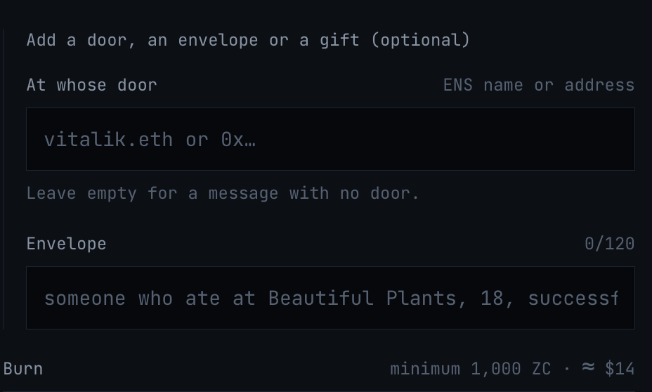
Then I see:
Door
Envelope
Gift
And I have no idea how these concepts relate to each other.
From reading the landing page, I eventually figure out that a Door is basically a way to send a direct message to someone.
I think.
The placeholder helps me infer that the Envelope is some kind of identity or name attached to the message.
But I'm figuring this out after coming back to the product multiple times.
A normal user probably isn't going to do that, and I still haven't figured out what Gift does.
Then another question appears.
If my message is public, what exactly is the Envelope doing?
These concepts might make perfect sense once you understand the lore, but the interface is asking me to understand the product's vocabulary before I understand the product itself.
On the same screen where I'm trying to write and burn a message, I can also see the board of previously burned messages, filters, rankings, and explanations of how people got there.
There's a point where a product has to decide what the primary job of a page is.
Here, my main job seems to be:
Say something and burn tokens to publish it.
So help me do that!
I still think showing previous messages is useful, in fact, seeing the top burns could help me understand how much people usually spend and what kind of content gets posted.
But I don't necessarily need the entire exploration experience/settings next to the composer.
If there's already another place to explore the full board, I'd intentionally show less here.
Just give me enough context to help me act without turning the creation flow into a full discovery page.
I understand choosing between:
Public | Anonymous
Those describe an outcome I care about, but then I see another option:
Pay with ETH
Wait, that's not another communication mode, that's a funding method, right?
From what I can tell, the product swaps my ETH into ZC behind the scenes and then burns it, that's actually pretty convenient.
But it feels like a feature of the Public or Anonymous flows, not a third sibling option.
If I choose “Pay with ETH,” I immediately have another question:
Is my message public or anonymous?
The UI is mixing two separate decisions:
What kind of message do I want to send?
How do I want to pay for it?
I'd separate them.
First:
How do you want to speak? -> Public or anonymous.
How do you want to pay? -> ETH, zipped funds, or whatever options are available.
That's a much easier mental model.
At the "From eth tab" I see:
“Spends 9.5366 ETH from your ETH note: about 9.4412 ETH buys at least 1,800,000 zc and burns them, 0.0954 ETH (1%) to the relayer for gas. The swap pays the sales tax like any trade.”
That is a lot of information for something that could probably start with:
Total: 9.5366 ETH
Fees: 0.0954 ETH
View transaction details ↓
I'm glad the details exist. I just don't need all of them competing for attention before I've even confirmed the transaction.
This is exactly the kind of information that should be available, not unavoidable.
Inside the public flow I see copy like:
“Rather nobody knew it was you? Speak anonymously from zipped coins.”
But I've already been presented with Public and Anonymous as separate options.
I don't need the interface to sell me the other path again while I'm already inside one.
In general this kind of reinforcement wouldn't bother me, and it could even help with feature discovery. But in an interface with this much information density, every extra sentence has a huge cost.
The distinction between Public and Anonymous is already clear from the mode selection. Repeating it again just adds more competition for my attention.
Then I notice:
use a 12 word zip phrase
But I didn't realize it was an action at first. It looks like secondary text, not a button.
This took me way too long to find the first time. That's an affordance problem.
If clicking something changes the way I authenticate or unlock my identity, it shouldn't rely on me discovering that some gray text happens to be interactive, especially if it's an important alternative flow.
Make it look actionable!
Then I get:
“Your zip key is derived in this browser from a wallet signature. Nothing is sent to a server. Smart-contract wallets may produce a different signature each time: back up the phrase after zipping.”
Useful. I actually want this explanation to exist, but i don't need it permanently sitting in the main flow. Give me:
Your key stays local to your browser. ⓘ How does this work?
Then let me go deeper if I care.
There's an important difference between giving users access to information and making every piece of information compete for attention all the time.
Then I move to Zip.
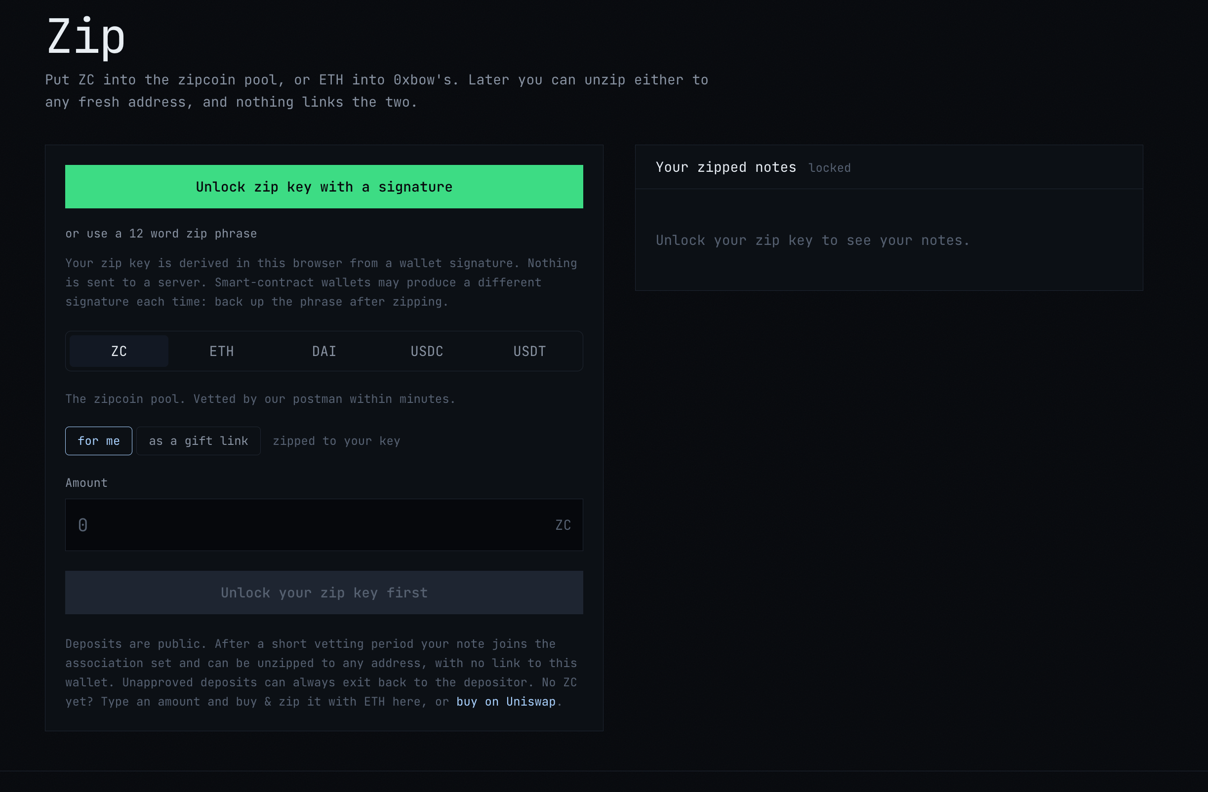
>I define the amount.
>Approve.
>Zip.
Boom.
That was easy.
The core interaction is actually very simple. Which makes the amount of explanatory UI around it feel even more noticeable.
Then I see my note and its status says: Vetting
Okay... what does that mean??!
I happen to have context on how Privacy Pools work, so I can roughly infer what's happening. But the product shouldn't depend on that.
Is my note waiting for some kind of compliance check? Who is vetting it? How long does it usually take? Can it fail? What happens if it fails?
This is the perfect moment for contextual education because now the term is directly relevant to something I care about.
Something as small as:
Vetting ⓘ and on hover:
Your note is being checked before it becomes available for private withdrawal. Learn more →
The technical concept isn't the problem, it's not even hard to understand, but the unexplained system state about my money adds stress when the user moving funds.

That's it, I'm pretty sure this could be reduced by at least 50% without losing any useful information.
Right now, the footer takes up roughly a quarter of my screen for content that is mostly secondary: open-source info, contract addresses, and a few links.
All of that is useful to have but it doesn't need this much visual real estate.
This is another hierarchy problem: secondary information is getting primary-level space.
Tighten the spacing, reduce the vertical padding, and compress the contract addresses into a denser layout. Make it smaller!
Then I try Unzip.
I can immediately see my balance. Good.
And there's a warning before I continue.

The warning is relevant to the action I'm about to perform, can actually change my behavior, and appears at exactly the moment I need it
That's good contextual UX, and user behavior matters a lot in privacy tools.
Not every piece of information should be hidden.
The question we should ask is whether it helps me make the decision I'm currently making or if it adds noise.
This one does help me.
I see:
“The proof is generated here, in your browser. Our relayer submits it and pays the gas, so the receiving address never touches your wallet. The relayer can see your request, not your coins. Privacy grows with the number of notes zipped.”
This is actually interesting. If I'm trying to understand Zipcoin's privacy model, I want to read all of this, but right now I'm trying to unzip my funds!
The interface is mixing two different jobs:
Help me complete a task -- Teach me how the protocol works
Both are valuable. but I'd keep the execution layer simple:
UnzipPrivate withdrawal
ⓘ How does privacy work?
And then, behind that:
relayers, local proof generation, anonymity sets, Privacy Pools, whatever level of detail I want.
Let me explore the protocol when I'm curious. Don't make me study the protocol every time I want to use it.
Then I notice I can unzip to a zk.money tag.
Wait. Didn't that just launch two days ago? That was fast.
I like this kind of integration because it turns something potentially technical and complex, sending privately to a destination, into something much easier to reason about.
Instead of thinking about another raw address, I can use a human-readable identity. Nice!
This is the abstraction I want from a privacy product and what makes their UX shine.
At this point I've gone through the core product:
Speak - Zip - Unzip
And I look back at the navigation.
There's still a lot of options.

That's a lot.
The problem isn't that these destinations exist but that the navigation gives almost all of them the same visual weight.
There's very little information hierarchy.
As a first-time user, I want to quickly understand:
What are the main things I can do here?
To me, the primary product actions seem to be something like:
Speak
Zip / Unzip
Book, maybe
Then you have secondary destinations that don't necessarily need to compete with the core flows in the same navigation layer.
I'd either visually separate primary actions from secondary resources, group secondary destinations into a dropdown, or categorize them more clearly.
The goal should be that I can glance at the navbar and immediately understand the product's hierarchy.
Right now, everything looks important, and when everything looks important, nothing does.
Actually using Zipcoin is pretty straightforward:
Amount → Approve → Zip
Choose note → Unzip
Write message → Speak
Most of the perceived complexity comes from everything surrounding those actions.
Protocol explanations, project-specific terminology, alternate flows, transaction internals, secondary navigation, and educational content are all competing for attention.
Zipcoin needs an interface that reveals how simple the core product ALREADY is.
Zipcoin has a lot worth explaining.
Wallet signatures, Zip phrases, Privacy Pools, etc etc
That is w hat makes the product interesting, but educating me about the protocol and helping me complete a task are two different jobs.
Use Tooltips, Learn more links, Expandable transaction details, Docs hyperlinks
Give me every rabbit hole I could want but don't put all of them directly in my user flow.
Vetting is the perfect example.
I don't need to understand vetting before I've zipped anything.
But the second my note is labeled “Vetting” I want to know exactly what that means.
That's when the explanation becomes valuable instead of visual noise.
Speak, Zip and Unzip should feel like core product actions.
Analytics, docs, trials and token-related pages should feel secondary.
But the navbar presents almost all of them at the same level.
A good hierarchy doesn't just tell me what exists but it tells me what matters right now.
I don't think Zipcoin needs less technical depth, quite the opposite.
Give me every explanation, proof, protocol detail and rabbit hole I could possibly want.
Just practice a little selective disclosure in the UI too.
Let me zip, unzip and speak.
And let me ask for the rest when I want it.