
I land on the website.
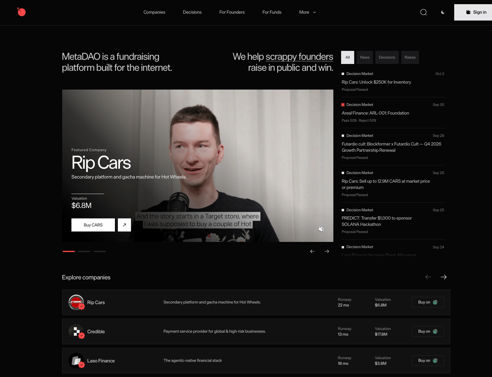
First impression: clean, serious, professional.
The UI, dense information, market activity on the side, company metrics, it gives me a bit of a Bloomberg terminal feeling.
Which is probably a good thing for a product asking me to put money into companies.
It feels credible.
Let's explore.
I open Companies.
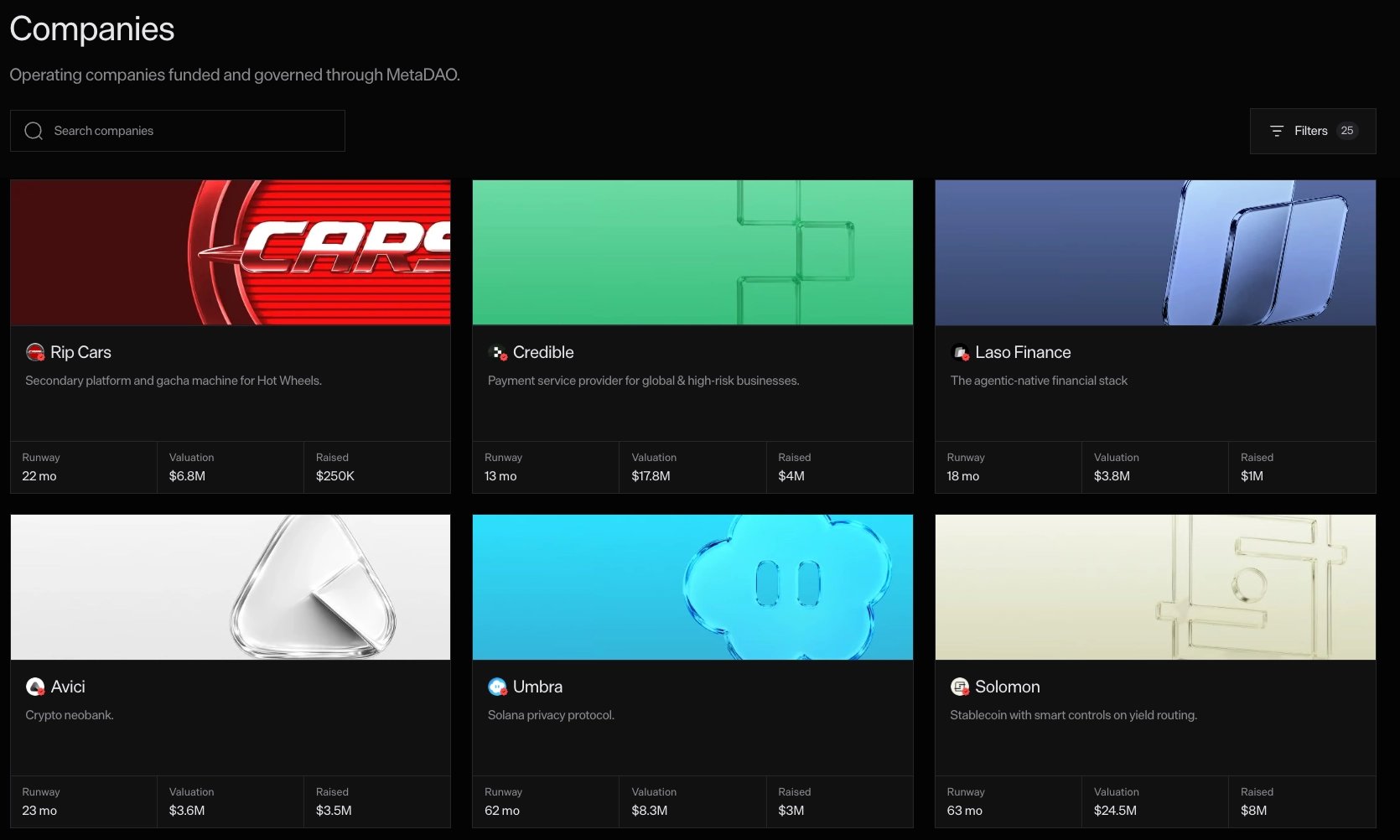
The cards are clean.
I instantly get some useful information:
Runway - Valuation - Raised
Good start.
But then I see:
Runway: 22 mo
22 months from when? Is that 22 months remaining today? Does this update automatically? Is it the runway they had immediately after raising?
I shouldn't have to infer what one of the three main metrics on the card actually represents.
Something as simple as: 22 months remaining
or a tooltip explaining how it's calculated would remove that ambiguity.
Then I try to actually explore the different companies, and here the experience feels underpowered.
What if I want to find:
the highest-valued company
the company with the most runway
the company with the least runway
the biggest raise
the oldest company
the newest company
I can't.
There's no obvious sorting control, and this is literally the discovery page!
If there's one place where I should have freedom to manipulate what I'm seeing, it's here.
Something crazy, memecoin launchpads have gotten really good at this, because they understand that discovery is not just:
“Here are all the assets.” But more like:
“Show me the assets based on what I care about.”
There's probably something to steal from them here.
The filters are:
Curated | Permissionless | Legacy
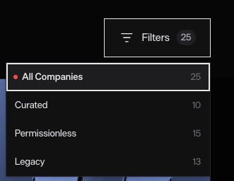
I can roughly infer the difference between Curated and Permissionless.
Legacy? No idea.
Again, this isn't necessarily a terminology problem, Project-specific categories are fine.
But if the category matters enough to become one of the three filters available, I should be able to understand what it means without leaving the page.
I open one of the companies.
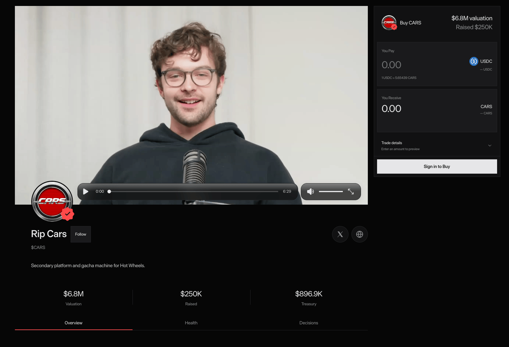
And immediately a founder video starts playing, I like this.
I'm looking at the founder's face, hearing them explain the company, while the product gives me valuation and fundraising information next to it.
I feel like a VC getting pitched, good feeling.
This is probably one of the strongest parts of the experience because the format actually matches the job I'm trying to do:
Do I believe in this company enough to put money into it?
There's also a trading UI right next to the pitch, great.
I can go from learning about the company to buying its token without leaving the page.
Except... I can only pay with USDC?!
If I don't have USDC, I now need to:
Leave MetaDAO → Open another app → Swap → Come back → Buy
That's a pretty expensive interruption in a flow where the user has already decided they might want to invest.
If possible, I'd let users choose from more assets and abstract the conversion underneath.
The user intent is:
“I want to invest $X in this company.”
Not to do some onchain asset gymnastics.
Then I see a Follow button... Interesting... Follow how?... Is MetaDAO becoming a social network? Click.

Turns out it's basically notifications through email or Telegram. So semantically, Subscribe or Get updates would probably be more accurate.
But that's the interesting part, if the button said Subscribe, I probably wouldn't have clicked it. “Follow” created curiosity and got me discovering a feature.
So technically, I think the terminology is wrong.
But as clickbait? Effective.
I'll allow it.
I start reading the company overview.
I get information about the company and the founders. Good.
But I only get the founders' names. No X, LinkedIn, GitHub or easy path to learn more about them.
If these founders are already public, why make me manually leave MetaDAO, Google their names, figure out which profile is real, then come back?
This is the kind of due-diligence friction the product could remove for me.
If the investment experience is:
Research → Build conviction → Invest
then anything MetaDAO already knows that helps me research should be handed to me.
Founder profiles, socials, relevant links, previous companies, whatever is public and useful.
Don't make every investor repeat the same detective work.
Then I reach Deal Terms.
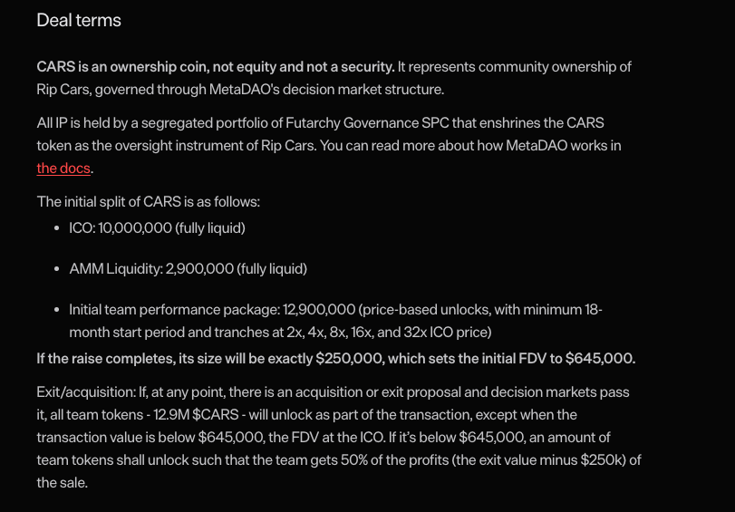
I read:
CARS is an ownership coin, not equity and not a security.
Okay... What exactly is an ownership coin?
Yes, maybe I should already understand the instrument before investing. But this also feels like the most fundamental concept in the entire product.
What exactly am I buying? What rights does it give me? What rights does it not give me How does it differ from equity?
If ownership coin is a MetaDAO-specific concept, make it clickable.
I don't need a giant explanation inline.
Just:
ownership coin ⓘ or What is an ownership coin? →
But “go search the docs and figure out what the thing you are buying actually is” is too much cognitive overhead for something this fundamental.
I'm about to put money into this!
I shouldn't feel like there's a chance I'm misunderstanding what I'm investing on.
Then I see the initial token split.
ICO: 10,000,000 CARS
AMM Liquidity: 2,900,000 CARS
Initial team performance package: 12,900,000 CARS
But what's the total supply? And what percentage does each bucket represent?
Raw token counts make me do math to understand the distribution. What I really want is something like:
ICO: 10M, 38.8%
Liquidity: 2.9M, 11.2%
Team: 12.9M, 50%
Not necessarily those percentages, I'm talking about the structure.
Tokenomics are fundamental to understand relative ownership, so percentages are often more useful than absolute token counts. Ideally I'd give users both.
Then I see Platform information.
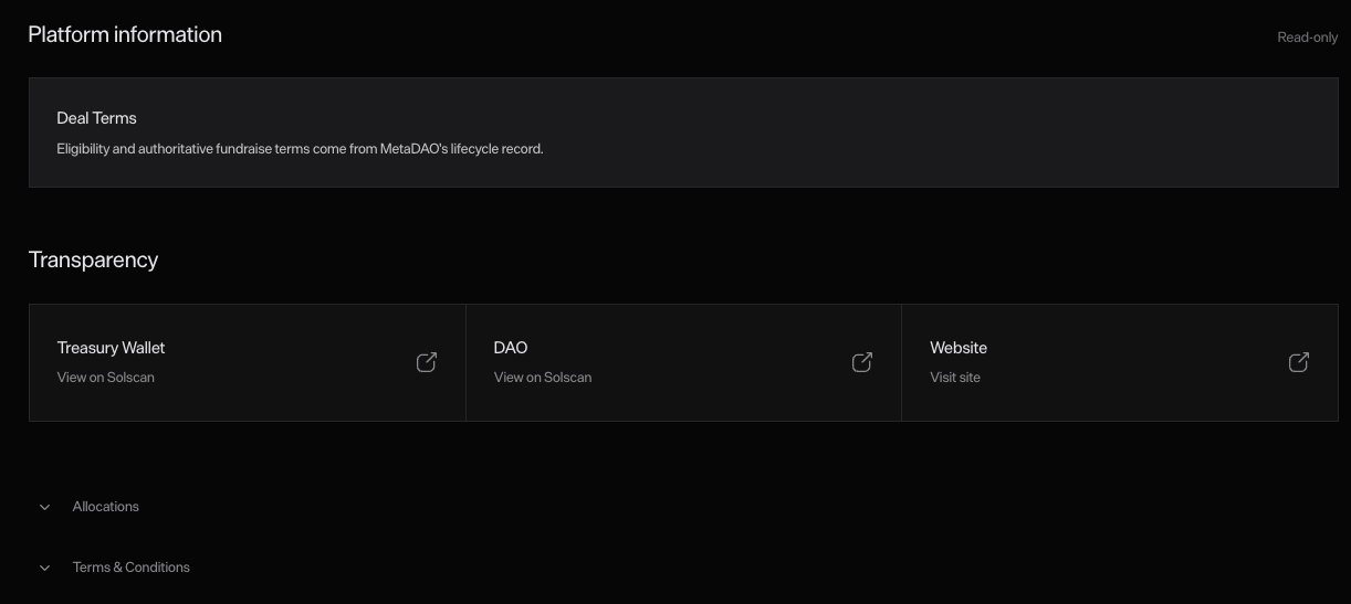
Deal Terms: Eligibility and authoritative fundraise terms come from MetaDAO's lifecycle record.
I have no idea what I'm supposed to learn from this.
What does “lifecycle record” mean? Why should I care? What action can I take here?
Then there's another section:
Allocations
The completed fundraise allocation is separate from secondary-market token swaps.
Again:
I can read every word. I still don't know what this section is helping me understand.
This is one of those cases where the copy is technically descriptive but not user-informative.
The interface is explaining the system using the system's own vocabulary.
I'd start with the user questions instead and then explain the mechanism.
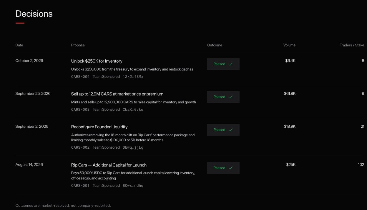
Now I reach the company's decision history.
Cool, I can see actual governance activity:
what was proposed, whether it passed, volume, dates.
I want to go deeper, I click around, nothing.
Click somewhere else, nothing.
Wait...
Oh, I can only open it by clicking the title.
Phew.
That was unnecessarily hard to discover, the entire row looks like one coherent object.
If the row opens a detail page, make the whole row clickable!
This is a classic click-target / affordance issue, don't make me hunt for the invisible interactive region.
I enter the decision detail.
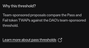
I see: Team Sponsored threshold
I don't know exactly what that means, but there's a tooltip! Nice.
And even better, there's a link to learn more.
Still not immediately intuitive, but now the interface gives me a path from:
“What is this?” -> “I can understand this if I care.”
That's exactly what I want, not every concept needs to be simplified/dumbed down but the right UX is just giving users a clear path to deeper information.
Then I see the final TWAP:
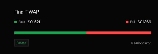
Pass: $0.1521
Fail: $0.1366
and a green/red bar.
I understand the numbers individually, but the visualization itself doesn't help me much.
What exactly is the bar encoding? Is it proportional? Is the important thing the absolute difference? The percentage difference? The threshold between both markets?
I shouldn't have to reverse-engineer the chart, a visualization should make the conclusion easier to understand than the raw numbers.
Right now, the numbers are doing more work than the visual.
I'd probably add something explicit like:
Pass market finished 11.3% above Fail
or whatever metric is actually relevant to the decision mechanism.
And alongside volume, I'd love to immediately know how many people participated.
$9.4K of volume tells me the economic activity, but it doesn't tell me whether that came from 3 people or 300. Those are very different but relevant signals.
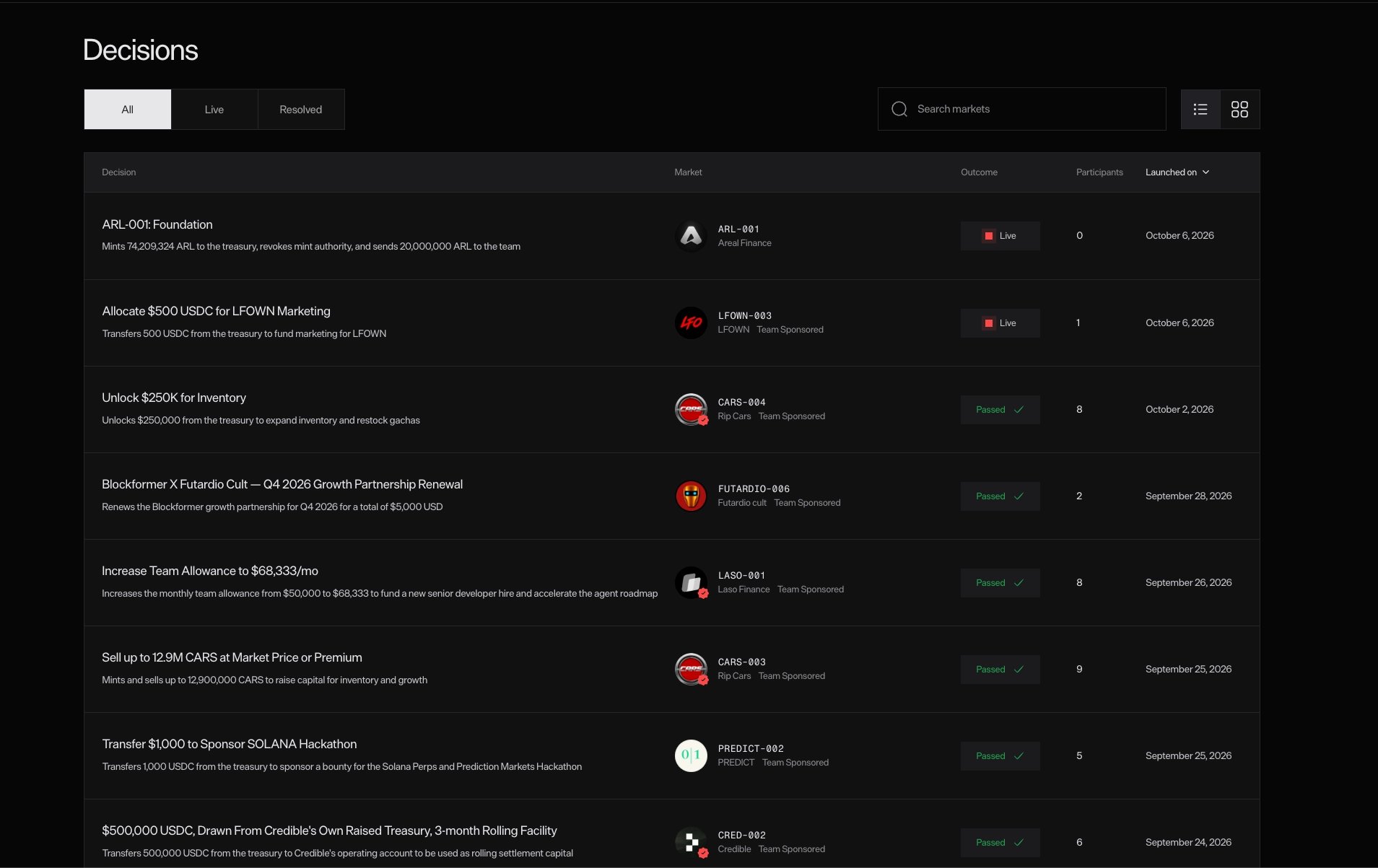
After roughly understanding the company experience, I go to the global Decisions page.
I like it, it shows me that things are actually happening:
new proposals, markets, outcomes, activity.
That's valuable.
But as someone who doesn't currently have a stake in most of these companies, I don't really have an obvious action to take. So the page works well as an activity feed, but less as a personalized product surface.
Eventually, I'd want it to answer:
Which of these decisions matter to me?
Companies I own, companies I follow, markets where I can participate.
Without personalization, it's interesting information.
Next stop: For Founders.
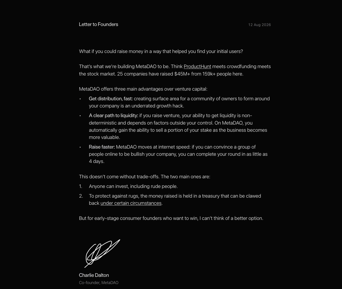
I'm assuming this page should convince me to raise through MetaDAO and explain how to do it.
Instead, I get a letter from the founder. Visually, I actually like it. It feels serious, personal, almost YC-ish.
But functionally, this is basically a full page being used for a vision pitch. If you've already convinced me to visit For Founders, give me the juice.
Tell me:
How does raising work?
How long does it take?
What companies qualify?
What does MetaDAO take?
What do I need before applying?
What happens after I raise?
What are the tradeoffs vs VC?
What happens to governance?
This page could basically function as a great founder FAQ.
Right now, I leave with the pitch, but not enough operational understanding.
Then I open For Funds.
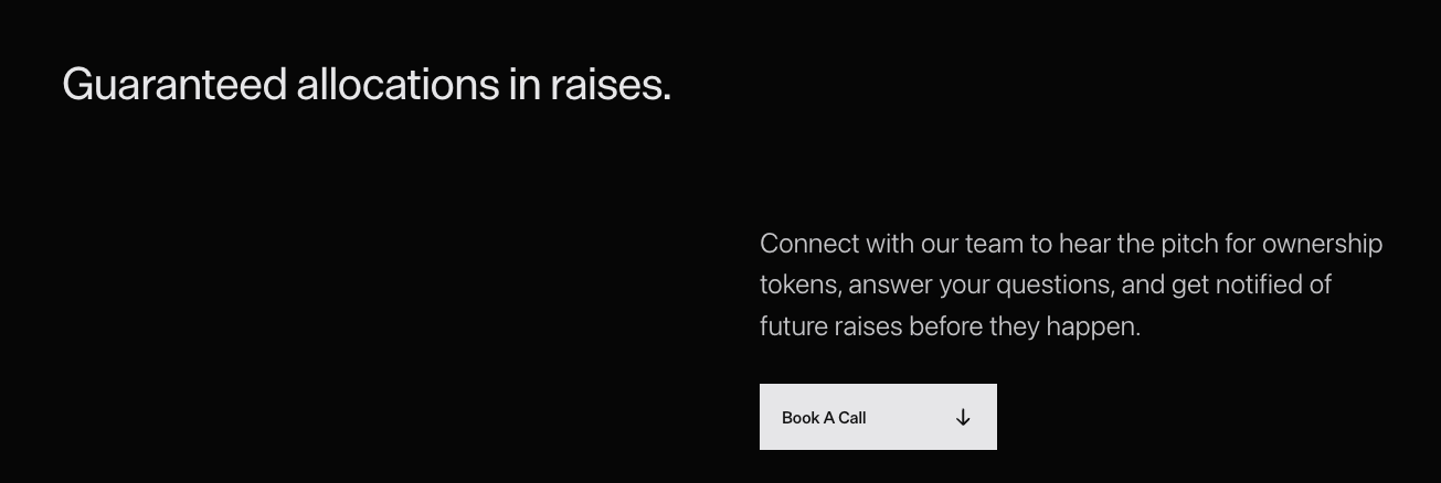
Okay, interesting.
It seems like MetaDAO wants to connect investment funds directly with companies raising on the platform. Makes sense.
I'm not a VC, so maybe I'm naturally not the target user here.
But something catches my attention:
“Get notified of future raises before they happen.”
Wait. Are funds getting early access to deal flow? Alpha?
If so... I want the alpha too!
So now I have questions:
What counts as a fund? Do I need to manage a certain amount of capital? Can an angel qualify? A DAO?
What exactly do funds get that normal users don't? Private information? Just notifications? And what do I need to do to access it?
If there's an actual differentiated benefit here, spell it out!
The page should clearly communicate:
What you get
Who qualifies
Why it exists
How to get access
Otherwise I'm left wondering whether the mysterious special fund button is just:
“You must have a lot of money to enter.”
The Companies page looks good, but it doesn't give me enough control over what I'm seeing.
If I'm evaluating investments, I naturally want to sort and filter by different parameters
Discovery more than only showing an inventory, should give users tools to find the subset of the inventory they care about.
The company pages already contain a lot of useful information. The opportunity is to go one step further and package it around the actual investor job:
Should I invest in this company?
If MetaDAO already has information to push me through a decision, don't make every investor reconstruct it manually.
Good investment UX compresses due diligence.
Ownership coin. Legacy. Team Sponsored. Lifecycle record. 🤯
These terms may all be perfectly valid inside MetaDAO's model.
The problem is specialized terminology with no obvious path to understanding it.
The "Team Sponsored threshold" tooltip is actually a good pattern:
Label → short explanation → learn more
I'd use that everywhere.
This might be the biggest compliment and criticism at the same time.
MetaDAO already looks serious, it feels like a place where real financial decisions happen. The next step is making every metric, visualization, definition, and interaction earn that same level of trust.
A financial UI shouldn't make me guess what 22 mo means, it shouldn't make me calculate token allocation percentages. it shouldn't make me discover that only a proposal title is clickable.
It should continuously reduce uncertainty.
MetaDAO made me feel surprisingly close to evaluating a startup investment.
The founder videos, financial metrics, deal terms, governance history and market activity create a pretty compelling experience.
I genuinely got the “Okay, I'm looking at an investable company now” feeling.
The biggest opportunity for improvement is turning that information into decision support.
Help me discover the companies I care about, understand what I'm buying, research the people behind it, interpret the governance data.
And then let me invest without making me leave the product to buy USDC first.