

In almost all Web 3.0 applications (Decentralized Applications or dapps), user interactions begin by connecting a wallet to the app, which is the equivalent of logging into any regular Web 2.0 website. This connecting process should be as simple and frictionless as it sounds, but it doesn’t seem to be the case.
I reviewed the connect wallet modal in 10 well-known Web 3.0 apps that are widely used in the DeFi sector. It was quite a surprise to see how inefficient and lackluster some of these modals were.
In this article, we will go through each app to see how they’re treating this process, get an understanding of how a proper wallet connection process should be, and propose a more user-friendly solution to this problem.
Let’s dive in.
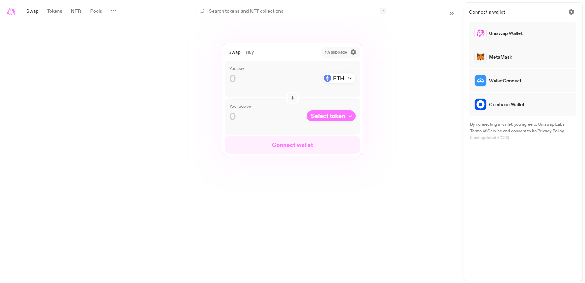
Uniswap is known as the OG decentralized exchange of the crypto space. Clicking on the “connect” button will bring up a side panel with a few options for connecting wallets. The main problem here is that other widely used wallets (such as Rabby, Phantom, Rainbow, and others) are not among the listed items. Although most of these wallets have the option to replace or act in place of Metamask, that’s not particularly an effective user experience practice.
A good practice for Web 3.0 apps is to provide some sort of guidance or directions for users new to this space, who may need to learn what a wallet is and how they should interact with the app. However, this option is not provided by Uniswap here.
Fortunately, “WalletConnect” is available by default, and users can connect their mobile device wallets to the app via this feature.
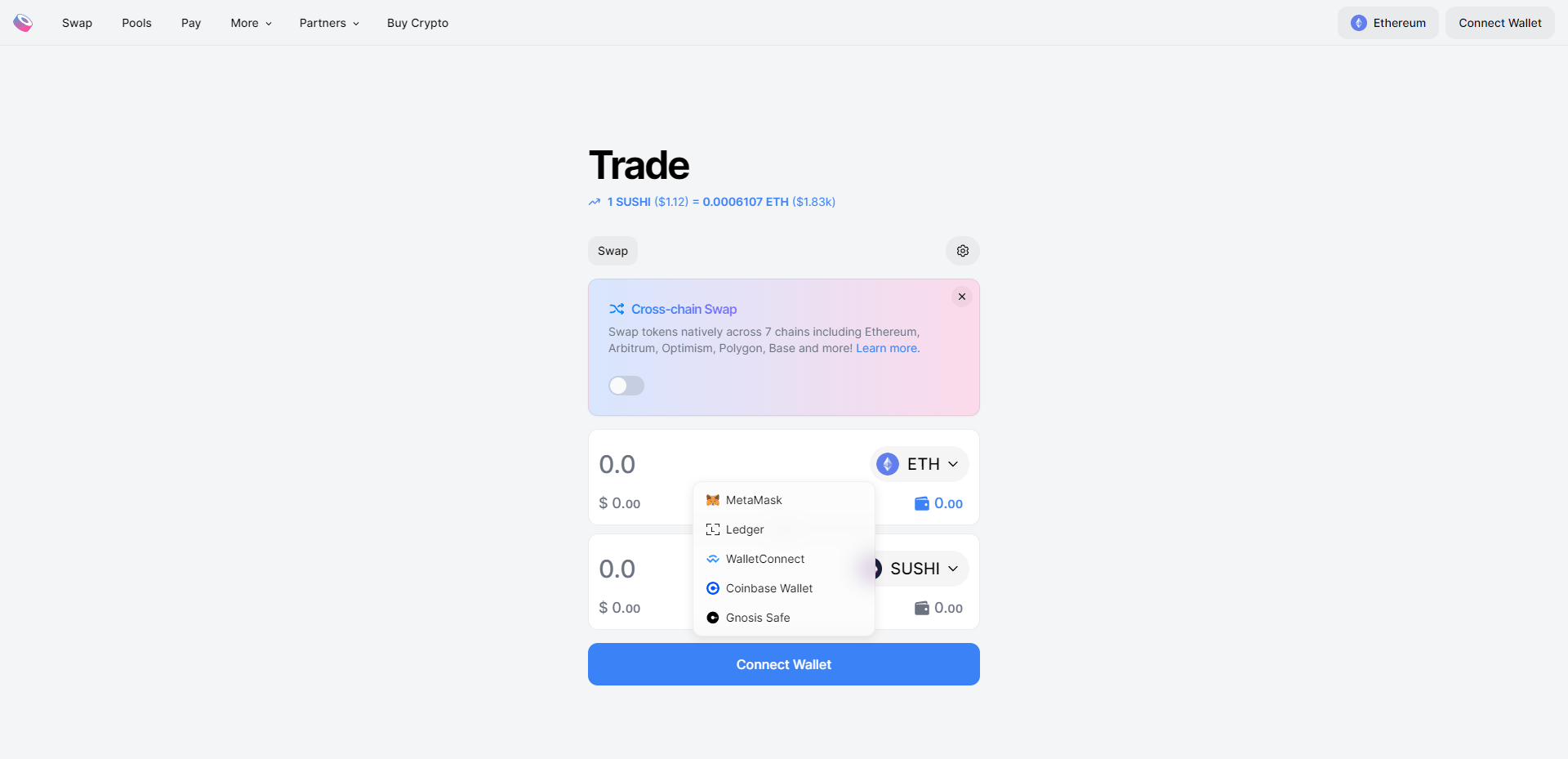
Sushiswap is another well-known decentralized exchange that supports many different chains. Unfortunately, the same cannot be said for the available wallet options to connect to the app. Much like Uniswap, there are limited connecting options and no guidance for new users. I had to switch my Rabby wallet with Metamask to be able to connect it to Sushiswap.
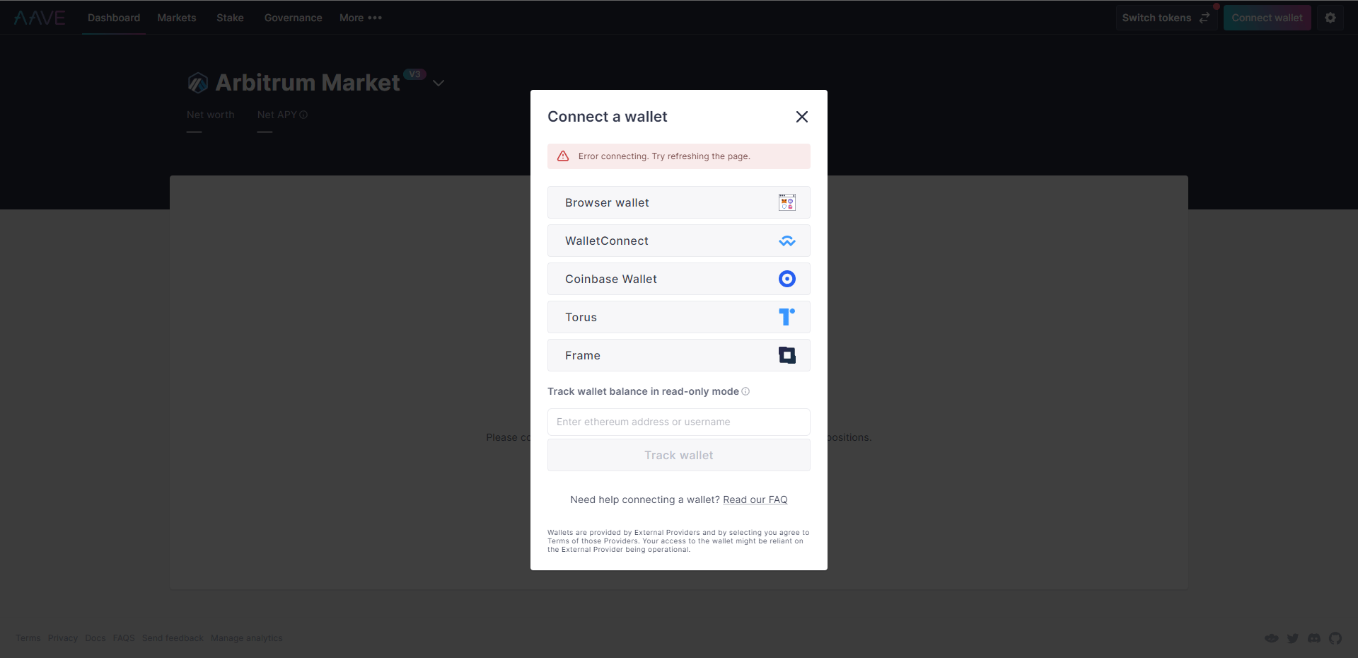
Things aren’t any better for Aave, one of the main lending platforms in DeFi. Wallet options are limited, and the “Browser wallet” only allows you to connect your default browser wallet to the platform. This means that if you need to connect any wallet other than your default one, you’d have to set it as your default browser wallet beforehand. Additionally, for some reasons I couldn’t understand, I was encountering a connection error even before attempting to select any of the items.
On a positive note, Aave has included an FAQ link that provides some directions (though not a comprehensive guide) for new users. There’s also an option to view any wallet address in read-only mode, which can be useful if you want to track other users’ activities on Aave.
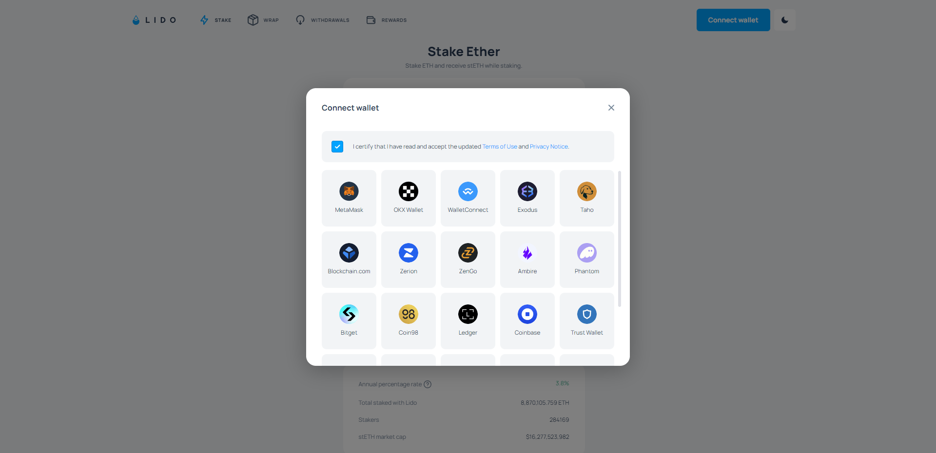
Lido’s “Connect Wallet” modal is a list of 20 wallets, which includes most of the commonly used wallets (but not all, such as Rabby and Rainbow). The problem is that there are too many options here, and finding the wallet you use might take some time. Additionally, there’s no guidance provided for new users.
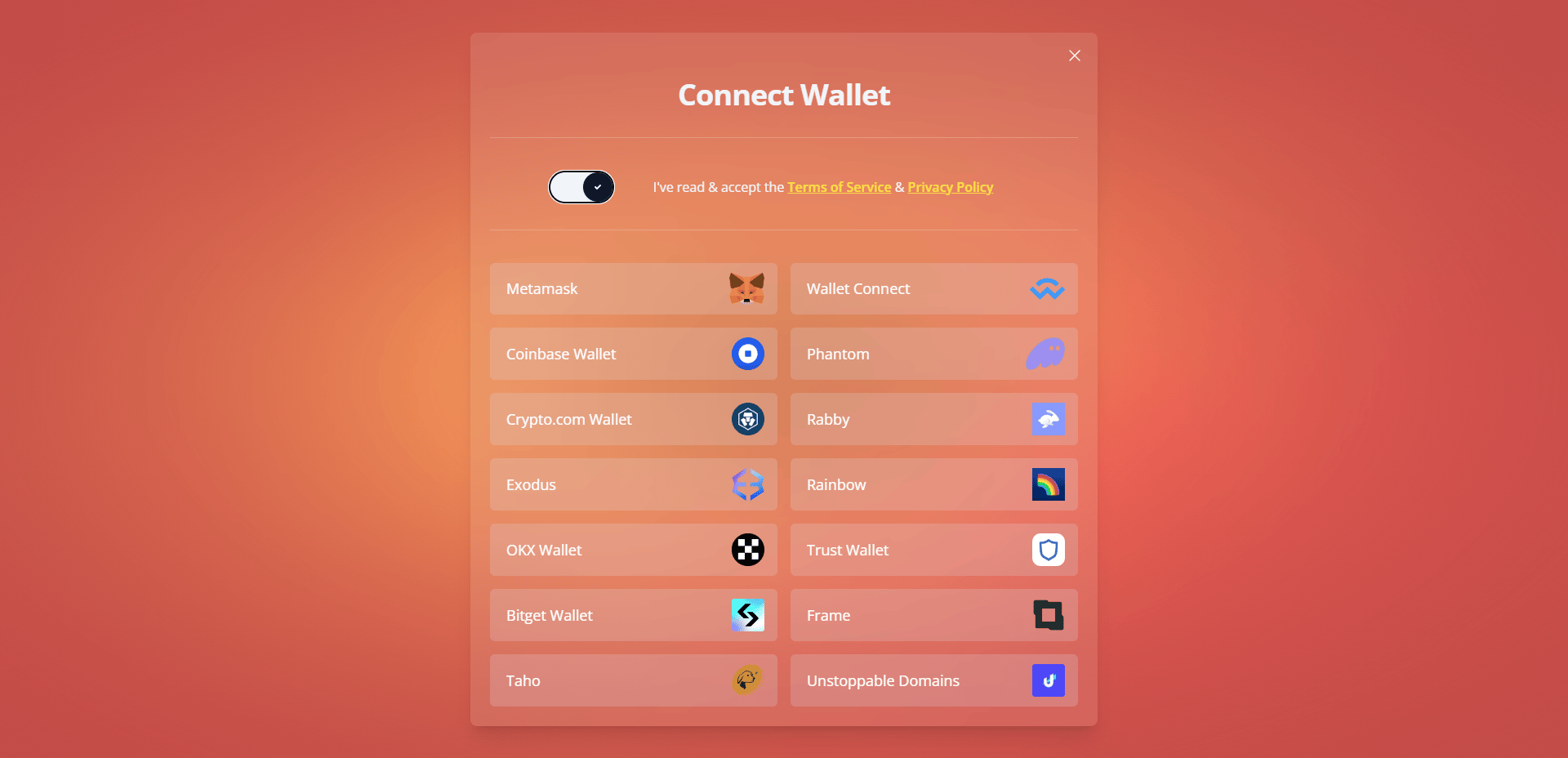
Rocketpool’s “Connect Wallet” modal shares similarities with Lido, as both of them are leading liquid staking platforms. Arguably, Rocketpool’s connect options are more comprehensive, even though they have fewer choices since most of the widely used wallets are included.
However, the same problems of having too many options and lacking assistance for new users are present here as well. There also appear to be some visibility issues with this modal screen, as it can be challenging to distinguish the white text from the background color.
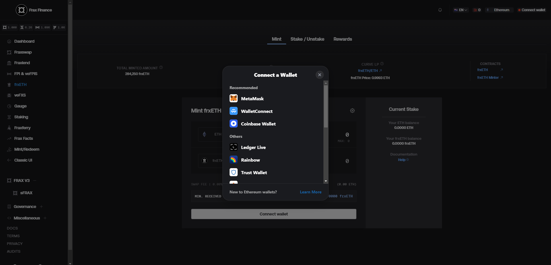
Frax Finance is utilizing RainbowKit, a rather straightforward modal for connecting wallets, listing the major wallets as options. There’s a link for more information on Ethereum wallets for new users which gives decent direction as to what are wallets and how users can get one for themselves. They refer to a guide provided by Rainbow wallet for this matter.
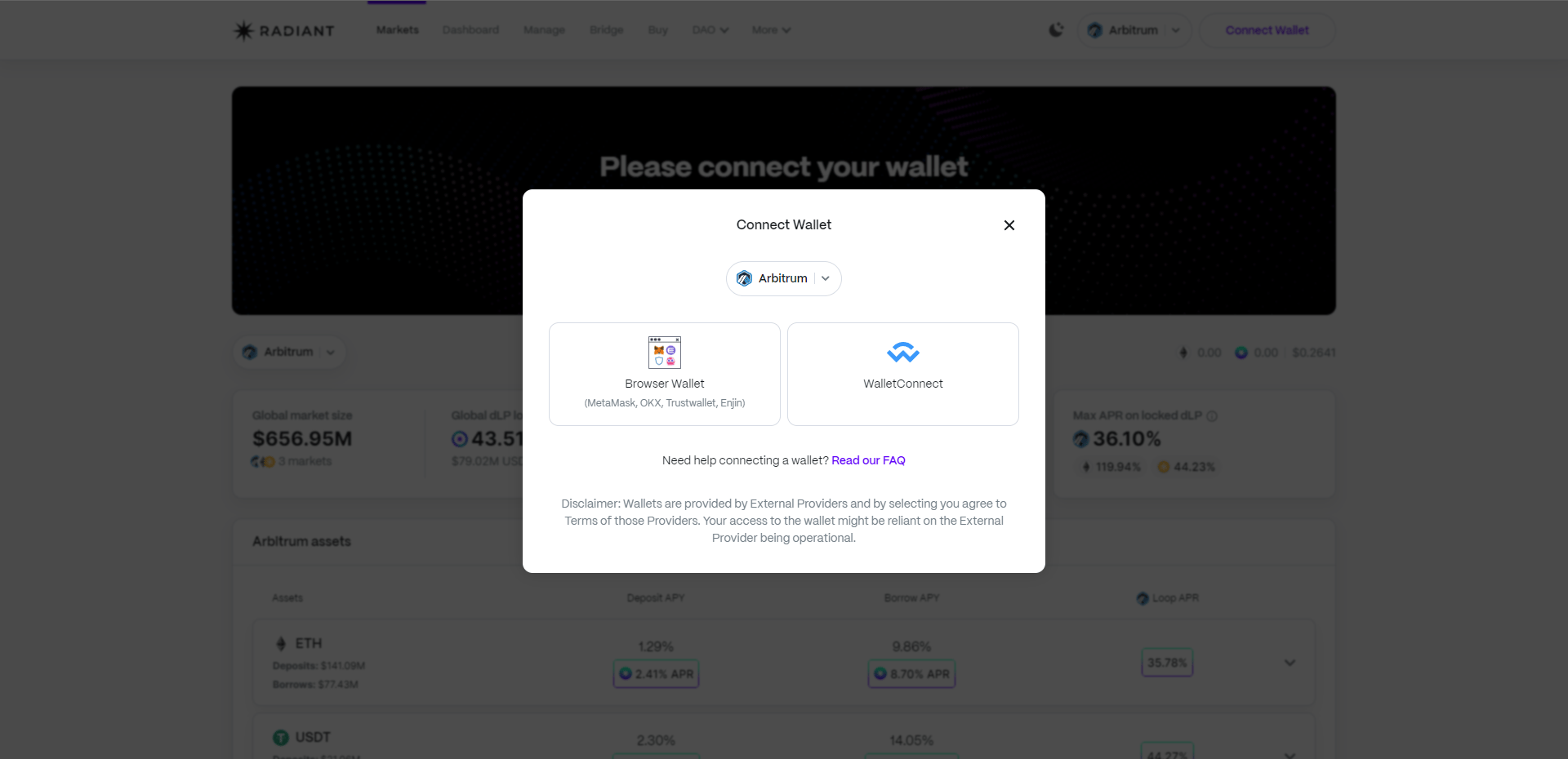
I’m not a fan of how Radiant is approaching the process of connecting wallets. In this modal you’d have to choose your network, and for selecting wallets, you’d either have to pick one of the four mentioned browser wallets or use WalletConnect.
My criticism here is that making users choose a network before connecting their wallet is unnecessary and redundant. It’s a process that could happen after users have connected their wallet and decided which network they want to operate on, based on their exploration of the app (e.g., after seeing the APY for different assets on different chains). Limiting user choices to only four wallets is not ideal either.
However, having a link to the FAQ is a positive. Although the guide provided in the link isn’t particularly newbie-friendly.
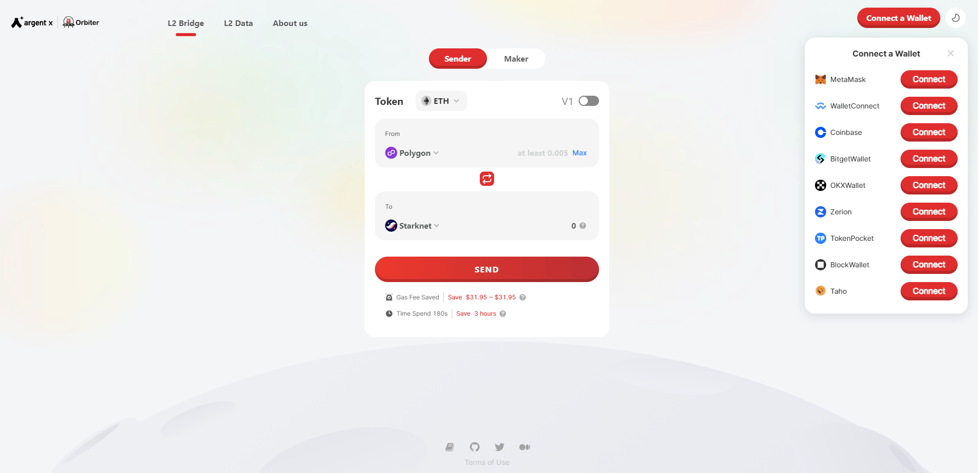
The pattern we observed in the previous apps is also replicated with the Orbiter bridge: limited connection options with no assistance for new users. Additionally, many commonly used wallets are not included in the list.
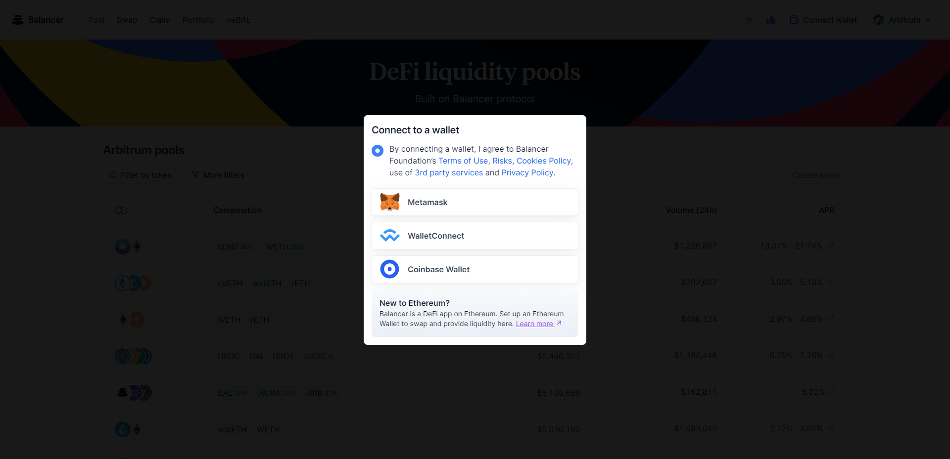
With only 3 options available to choose from, Balancer’s connect wallet modal is the most limiting I’ve seen among other apps. However, the link they’ve provided for new users is a guide by the Ethereum foundation which is a good starting point for anyone just setting their foot into Web 3.0.
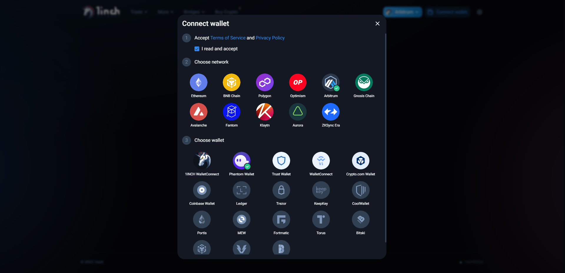
The way 1inch is handling the “Connect Wallet” process is overwhelming. Making users choose from 11 chains and more than 18 wallet options is simply too much. Once again, I believe the practice of having to choose your network before connecting your wallet is not a good one, and having so many wallet options to choose from can be confusing and time-consuming.
Another peculiar issue I encountered with this modal was that despite having Metamask as my default browser wallet, I couldn’t find it among the listed wallets which was frustrating.
Now that we have reviewed the "Connect Wallet" modal in these apps, we can outline the problems and common issues shared among them:
Most "Connect Wallet" modals either have too few wallet options, which can be limiting, or too many, which can overwhelm users when selecting their preferred option.
Some of the apps require you to choose a network in addition to selecting a wallet, which is unnecessary
Many apps do not provide any guidance or assistance for users new to Web 3.0, and the few that do often lack comprehensive and user-friendly guides that help them get started with their first wallet.
One solution to the first problem that is often overlooked is to determine which wallets are installed on the user's browser/system and only display the discovered wallets as connection options. Using this method, users won't be overwhelmed with many options to choose from, and they won't be presented with unrelated wallet options either.
A new Ethereum improvement proposal (EIP) that focuses on this issue has also been released recently. EIP-6963: Multi Injected Provider Discovery addresses the problem of discovering multiple wallets and significantly enhances the user experience in this process. Wallet providers and decentralized applications need to implement this EIP in their code to make it work effectively.
By underlining the problems and taking advantage of EIP-6963, I tried to come up with a more compelling and easy-to-use “Connect Wallet” modal. You can see the results here:
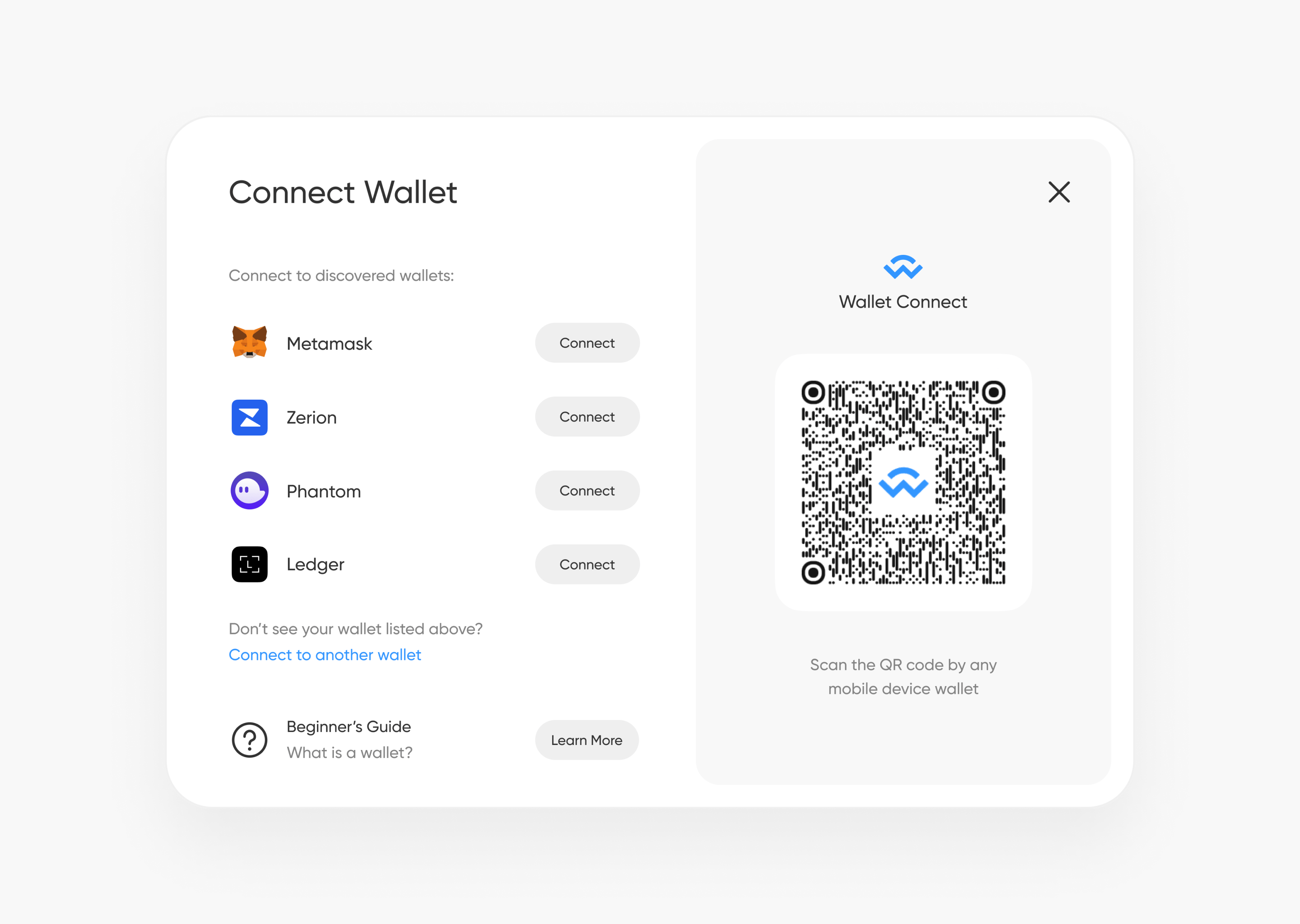
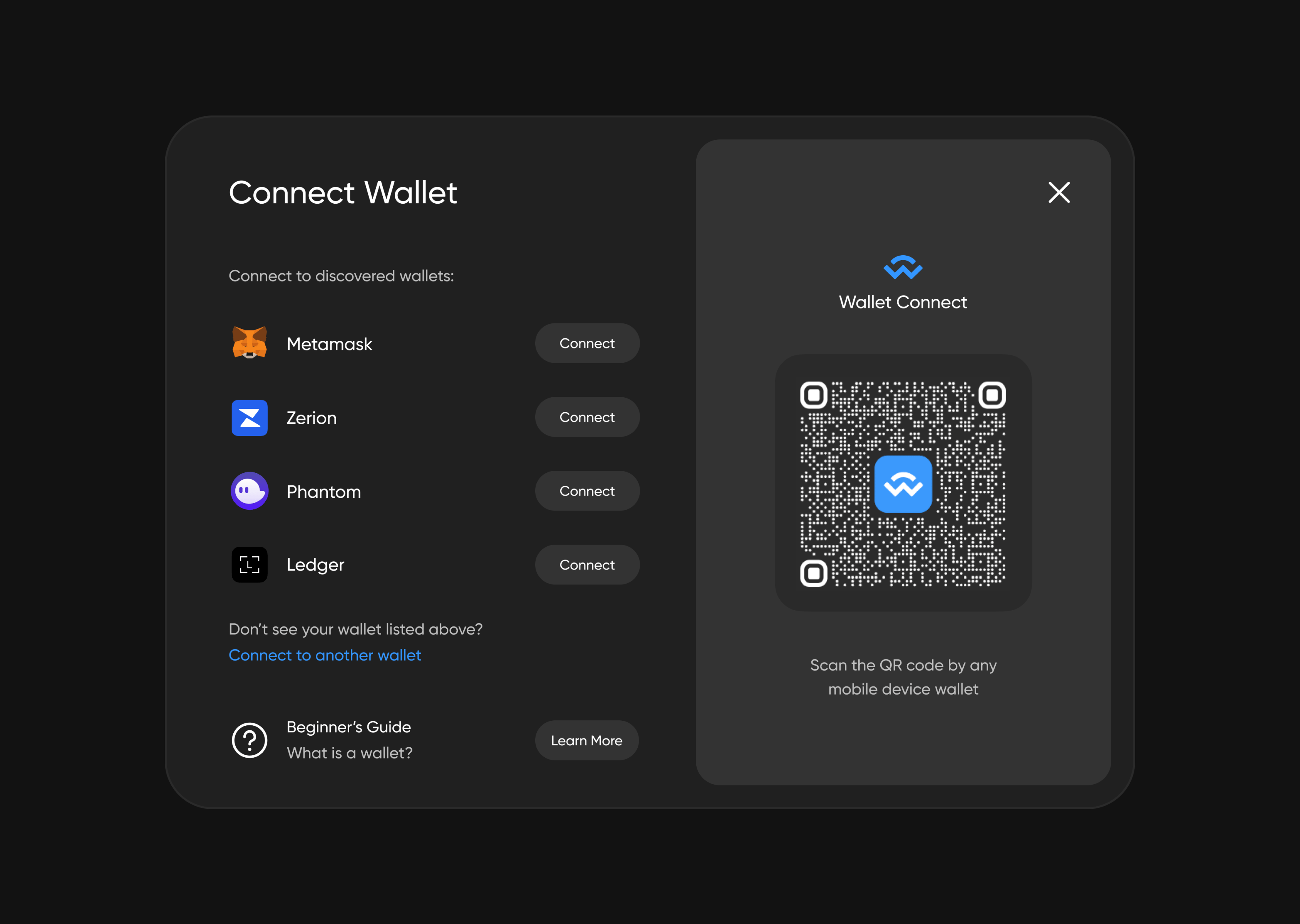
Here are the advantages of this connect wallet modal:
Users can see their installed wallets and won’t have to navigate through a list of unrelated wallet options.
If their desired wallet isn’t discovered for any reason, they can search for the wallet of their choice from a predefined list.
Links to educational resources for those who are just getting started with Web 3.0 are provided.
The WalletConnect QR code is readily accessible for connecting mobile device wallets.
This might seem like a small and negligible change to some, but if we are meant to improve the state of user experience in Web 3.0, we must consider every small detail, every interaction, and every screen and ask ourselves, “How can we make this better for users?”
Hopefully, we will see more and more wallet providers and dApps use this approach when designing their connect Wallet” modal.

You made it to the end of this article! Congrats, and I hope you got something useful out of it. I’ll do more of these deep dives into Web 3.0 UX in the future so subscribe to me if it’s something you’re looking for.
You can also reach out to me on Twitter (I‘m never gonna call it X) or email me. I’d be happy to connect with you!