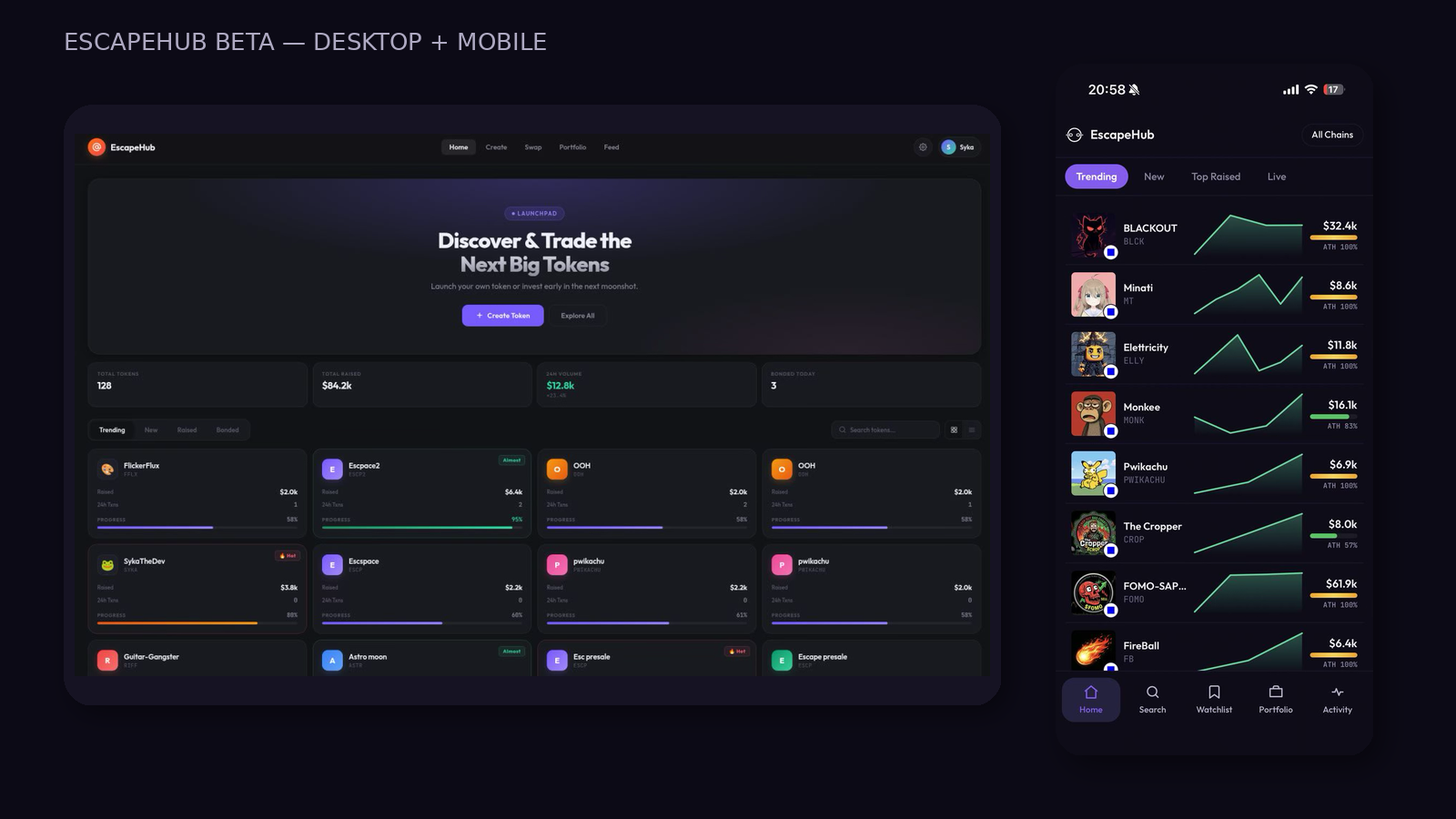
EscapeHub across web and mobile during my beta testing.
When I joined the EscapeHub beta, I expected the usual testing routine: click through a few screens, report some bugs, maybe suggest a feature or two, and move on.
Instead, I stayed with it for months.
I started with the web and desktop experience, moved into the private Android test, and later tested the iOS builds on both iPhone and iPad. That gave me a much broader view than I expected.
I was not just testing whether a button worked. I was watching the product change from one build to the next, sometimes because of things the testers had actually pointed out.
And that is probably the part I find most interesting about EscapeHub today.
The beta did not feel like a polished demo where testers were simply there to confirm decisions that had already been made. It felt much more like an active product workshop where ideas, problems and user behaviour could actually influence what came next.
Before writing this article, I also asked the EscapeHub team whether I could share details and screenshots from my tester access. They confirmed that I am free to share what I have tested and seen. Their only request was a reasonable one: not to make temporarily broken or clearly unfinished beta behaviour the main story.
I think that is fair, because a beta screenshot is always a snapshot of one moment in development.
From a beta page to something that feels like a real product
The biggest change is difficult to reduce to a single feature.
It is the overall feeling of the product.
Early in the test period, EscapeHub still felt very much like a launchpad being assembled in public: different layout ideas, changing portfolio screens, experiments with navigation, feeds and themes, and plenty of small details still moving around.
A few months later, the mobile app felt much more coherent.
Login, wallet handling, portfolio, watchlist, trading, activity and token discovery were starting to feel like parts of the same product rather than separate features placed next to each other.
That development is one of the things I liked most about being part of the beta.
A roadmap can promise almost anything.
Actually watching a product become cleaner, more connected and easier to understand from build to build tells me much more.
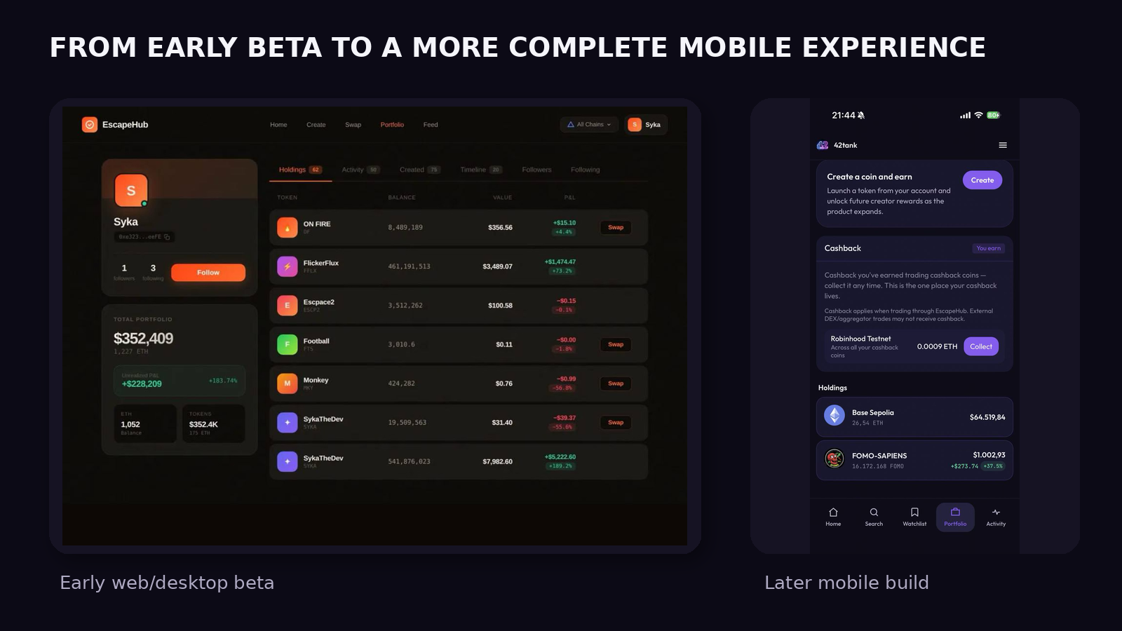
Two snapshots from different stages of the beta. The interface changed substantially over time.
Testing the same product from four different angles
One of the most useful parts of my testing was being able to use EscapeHub on Desktop/Web, Android, iPhone and iPad.
The same feature can feel completely different depending on the platform.
Something that looks perfectly fine on a desktop monitor can suddenly feel crowded on a phone. A navigation pattern that makes sense on Android can feel unnatural on iOS if it ignores gestures users already expect.
Even something as small as the decimal separator can matter.
That is how I ended up reporting details such as the iOS decimal comma, the idea of using the familiar swipe-from-left gesture to go back, fullscreen-chart behaviour, bottom navigation when the keyboard is open, and elements that were positioned too high on an Android tablet.
None of these are headline features.
But they are exactly the details that make an app feel natural instead of merely functional.
My Android tablet was also very old, which actually turned into a useful reality check. When something behaved strangely, I tried not to assume automatically that EscapeHub was at fault.
Sometimes old hardware is simply old hardware.
That forced me to separate reproducible product issues from device-specific behaviour as much as possible.
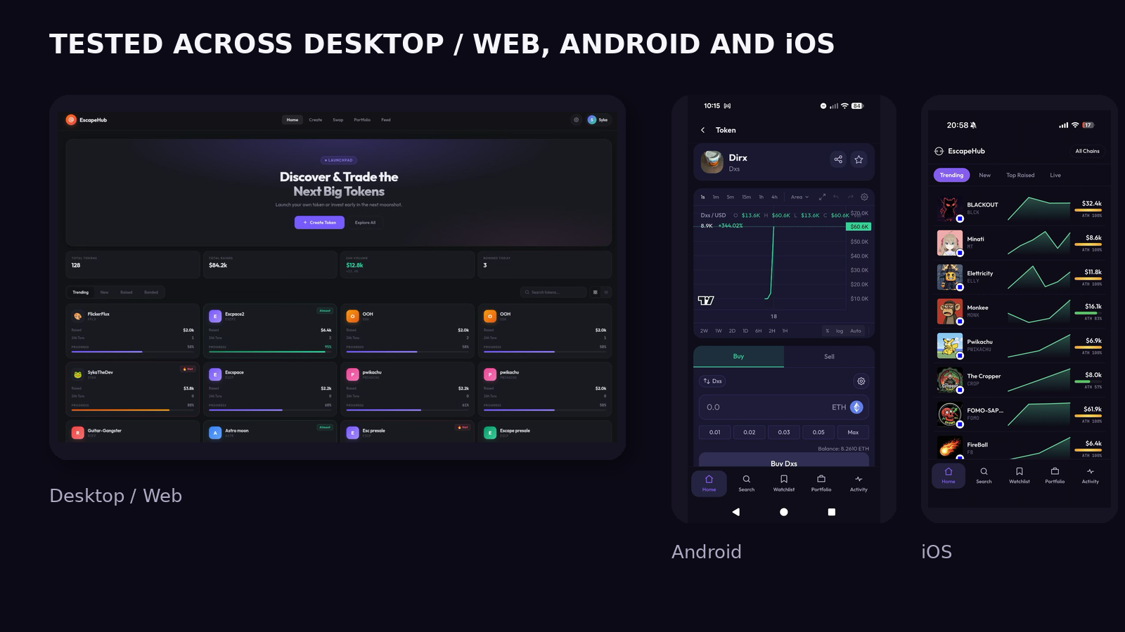
I tested EscapeHub on Desktop/Web, Android, iPhone and iPad, which made platform-specific details much easier to spot.
The thing that impressed me most: feedback actually went somewhere
The strongest positive impression I took from the beta was not that every suggestion was implemented.
It was that feedback was taken seriously enough to be discussed, reproduced and tracked.
That distinction matters.
One example was mobile data usage. During one Android test, the app used roughly 830 MB of mobile data in about 30 minutes. I have an unlimited plan, so it did not hurt me personally, but for another user that could become a real problem very quickly.
The team immediately treated it as something worth investigating and moved it into the bug list.
Another example was buying an exact token amount.
I tried to buy exactly 1,000,000 tokens and noticed that the calculation did not give me exactly the amount I had entered. The team agreed that the logic should be separated so that the user receives the precise token amount they type.
The iOS decimal-comma issue was another concrete report that later appeared in the release notes as a fix.
There were many smaller examples too: filters, charts, balances not refreshing immediately, a Create button that I felt should be easier to find, a filter bar that should return when scrolling back up, more useful trade-history filters, and clearer Activity information.
Some became bugs.
Some became ideas.
Some were planned for later.
And some were discussed but not adopted.
For me, that is actually a healthy sign.
A team that says yes to every tester is not necessarily listening. Sometimes it is just promising.
EscapeHub also explained why it did not want to do certain things, and I actually prefer that. It makes the feedback loop feel more like real product development and less like a suggestion box.
Onboarding started to feel much less “crypto-only”
Another area where the progress became very visible was onboarding.
During the later tests, the account flow brought together saved wallets, embedded accounts, Google, X, Apple, email and the option to import an existing wallet.
The team also worked on wallet recovery and on making parts of the app accessible without requiring an account immediately.
That matters.
A launchpad can have excellent technology and still lose people in the first two minutes if the wallet flow is confusing.
I also liked the direction of the deposit experience: QR-based receiving, fiat on-ramp options, and a portfolio that can show a new user how to fund it instead of simply presenting an empty screen.
For experienced crypto users these things can look basic.
For everyone else, they are the difference between:
“I understand what to do next.”
and
“I am closing the app.”
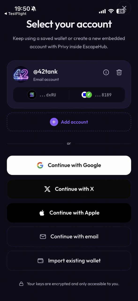
A later account flow combining saved wallets, social login, email and wallet import.
Multichain became something I could actually see and use
EscapeHub has talked about multichain from early on, but during the beta it gradually became something tangible rather than just a label.
I tested Base/EVM flows as well as Solana-related functionality, All Chains views, chain-specific portfolio behaviour and different token flows across networks.
Later builds showed holdings from multiple test networks and chains inside the same portfolio.
That is where the product started to make more sense to me as a whole.
The goal was not simply to add a chain selector.
It was to make token creation, discovery, trading, portfolio data and eventually migration work within one consistent environment.
There were still chain-specific issues during testing, especially around balances and some Solana actions, but the direction became much clearer:
one product, multiple chains, without forcing the user to treat each network as a completely separate application.
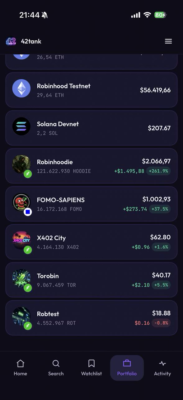
A later test build showing holdings from different networks and chains inside one portfolio.
The technical explanations gave me more confidence in the direction
I am not a developer, so I am careful not to pretend that I independently verified the architecture.
But I appreciated that the team was willing to explain what was happening behind the interface.
For example, they described a data setup where raw blockchain data is stored and then processed by EscapeHub’s own indexer.
They also described a fast lane for immediate updates and a slower verification lane that checks the data again.
The idea is that if a network hiccup or missed event causes something to disappear temporarily, the system can rebuild the correct state instead of relying on whatever happened to be cached at that moment.
The team also explained its graduation flow as atomic: the transaction that completes the bonding curve is intended to open the trading pool at the same time, rather than relying on a separate migration worker later.
Another example was the “hub” suffix for addresses, which they said is found locally in the browser or app through a deterministic search and then verified.
These are not features I expect a normal user to think about.
In fact, the best infrastructure is usually the infrastructure users never notice.
But as a tester, those explanations helped me understand why the team sometimes spent days on changes that looked almost invisible on the surface.
And I think that is important.
A new button can be added quickly.
Reliable data, balances, trading state and chain handling are much harder.
I would rather see time spent there than see ten flashy features piled on top of a fragile core.
Trading started to feel increasingly integrated
Trading naturally sits at the centre of a launchpad, and this was another area where I could see the mobile experience becoming more complete over time.
Charts became more integrated, buy and sell flows evolved, different timeframes were added, fullscreen behaviour was worked on, and the same token page increasingly became the central place for understanding and trading a token.
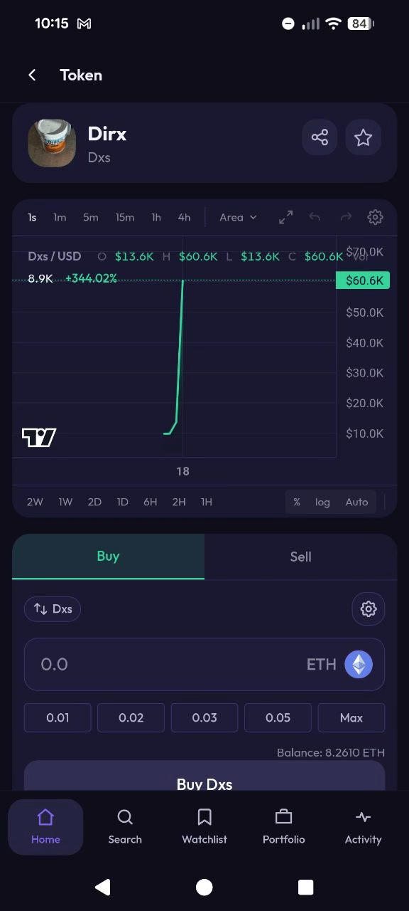
Trading and charting became increasingly integrated into the mobile experience.
During testing, I also saw why seemingly small details matter.
For example, whether balances update immediately after several trades, whether the exact amount entered is shown correctly, whether a decimal comma works on a European keyboard, or whether a trade appears correctly in the history.
Individually, these can look minor.
Together, they define how trustworthy a trading interface feels.
Creators are becoming a bigger part of the experience
One area I find especially interesting is the connection between token creation, trading and creator earnings.
During testing, the model was explained as giving token creators 0.5% of the trading volume of their token, with those rewards intended to remain persistent even after a token graduates to a DEX.
Before bonding, the token is traded through EscapeHub. After graduation, it can become tradable through the relevant DEX as well, while the creator reward mechanism is intended to continue.
That immediately made me think about the creator experience beyond the launch itself.
For example, I suggested showing creator rewards centrally inside the portfolio and offering something like “Claim all token fees” instead of forcing creators to open every token individually.
I think features like that are important because they turn token creation from a one-time action into something that can actually be managed over time.
EscapeHub is becoming more than just “create and trade”
I also liked seeing the product move toward a broader social and activity layer.
Followers, following, watchlists, activity feeds, price alerts, follower notifications and richer trade-history ideas all came up during testing.
Not all of these were finished features at the same time, and I do not want to present them as if they were.
What mattered to me was the direction.
EscapeHub was starting to feel less like a page where you create a token and more like a place where you can discover, follow, trade, monitor and manage what is happening around those tokens.
That changes the character of the product quite a lot.
It becomes less of a tool you visit for one transaction and more of an ecosystem you might actually keep open.
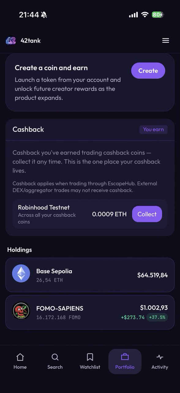
Rewards and portfolio features began to expand the experience beyond simple token trading.
Product first is probably the right strategy
One of the comments from the team that stayed with me was their decision to focus on making the product solid before pushing marketing harder.
They had already learned how difficult it is to create lasting attention around plans and promises alone.
Their view was simple:
It is much easier to explain EscapeHub when people can open the app, use it and understand the difference themselves.
After months in the beta, I agree with that approach.
A surprising amount of the work I saw was not glamorous at all:
authentication, wallet recovery, indexers, refresh logic, decimal handling, navigation, app-store approval, data usage, portfolio calculations and dozens of little UI decisions.
Those things do not make exciting announcement posts.
They do, however, decide whether a product feels trustworthy and usable after the initial excitement wears off.
And I think EscapeHub became noticeably better in exactly those areas while I was testing it.
What I take away after months of testing
I obviously saw bugs.
That is what private testing is for.
There were moments when login broke, balances lagged, a chart looked wrong, a button did not respond or a feature behaved differently on one device than another.
What makes me positive about EscapeHub is not the absence of those moments.
It is what happened around them.
Testing was sometimes paused deliberately while larger changes were pushed.
Known issues were collected openly.
A diagnostics tool was added.
Testers were asked for opinions on themes, navigation, feeds and flows.
The team thanked the testers more than once and explicitly said that feedback had changed parts of the product.
And I could see several of my own reports reappear later as fixes, tickets or design discussions.
That makes the months I spent testing feel worthwhile.
I started by testing a launchpad.
By the end, I had tested a much broader product across Desktop/Web, Android, iPhone and iPad: wallet onboarding, multichain portfolios, trading, creator mechanics, social ideas, activity feeds and a mobile experience that had changed significantly from the early builds.
What I like most is that EscapeHub increasingly feels like it is developing its own identity.
Not simply another launchpad with a different colour scheme.
The combination of multichain support, mobile-first development, creator mechanics, portfolio tools, social elements, onboarding and the work happening behind the scenes gives it a much more ambitious direction than what I saw when I first entered the beta.
I do not know exactly what the final public version will look like.
During active development, I would be suspicious of anyone who claimed to know that.
But I have seen enough of the process to say this:
EscapeHub today feels far more like a real product with its own direction than it did when I first opened the beta.
And that is exactly why, after months of testing, I am still excited to see what happens when the wider public gets to use it.
Disclosure: This article is based on my personal experience as an EscapeHub beta tester. Screenshots come from different beta/test builds and may not represent the current interface. Testnet and demo balances shown in screenshots are not real-money balances. Nothing in this article is financial advice.